Posts

Testing Challenges

Image
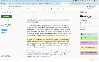
 Day 30 # Review the complexity of a website's content with the Hemingway app  The Hemingway app is a popular free writing tool created by Adam and Ben Long. Hemingway Editor helps you to edit your writing so that your words are clear and powerful. The app checks your words and sentences which point out areas you can change to make your writing better. Hemingway Editor is easy to blogs, posts, business communication, fiction, essays, or academic papers. It is one of the quickest and easiest ways to find the passive voice and overused adverbs in your texts to make them easier to read.  There is a desktop version of the Hemingway Editor available for Mac and PC, which is quite cheap. But most users will prefer to use the free online writing editor. Hemingway Editor is simple to use.  First, copy your text.  Then go to https://www.hemingwayapp.com and delete the example text.  Paste your text into it and edit the highlighted things in your writing.  Everything is color-coded. Adverbs

Testing challenges

Image
 Day 29 # find 3 accessibility issues without using the evaluation tool. I was browsing an art and craft website to check issues for accessibility.  First, I switched off my mouse pad and tried to keyboard focus on the page. When I was tabbing on-page, after search it’s not navigating to other elements on the page.  2. I disabled the images and tried to understand the text alternatives but few of them are low in color contrast.  3. When I was tabbing from search its directly navigating link to the footer page not on the main content

Testing challenges

Image
 Day 28 # T esting a word document issues for accessibility I have downloaded a word document from online and used an inbuilt accessibility checker to check the issues. There I observed some missing alternative texts, images, or objects not inline, check the reading order, hard-to-read text contrast. I tried to change the contrast and solved the issues by changing font and color contrast. What the Checker Won’t Do If your headings are text made big and bold, not real headings,  the accessibility checker won’t see a problem. So you will also have to check headings yourself. The checker will tell you if an image has no alternative text. But it can’t tell if an image has an inaccurate or badly-written alternative text.  So you must check all images, even if the checker says they are OK. You’ll also have to check whether your page is using  tabs where it should use a table,  fonts, like Wingdings, where it should use images,  or images where it should use text.  So the checker is no substi

30days of testing challenges

Image
Day 27 # learn how to use your mobile screen reader I have an android phone, so It has an inbuilt screen reader on my mobile. Initially, it took time to explore and learn commands. Using a screen reader to navigate a device can be useful to anyone who is visually impaired. Settings – system- accessibility-select to speak (hear selected text), TalkBack on Swipe right or left to move between items Double-tap to activate an item Drag two fingers to scroll To turn off TalkBack Tap the switch. You will see a green outline Double-tap the switch. On the confirmation message, tap OK. Then double-tap OK
Image
 Day 26 # Fi nd an accessibility issue on a website and report it. I used a wave evaluation tool for finding accessibility issues on the website text size normal and color contrast is also very low to read.
Day #25 Explore W3C's Before and After accessibility demonstration I was exploring with Voice over screenreader for before and after the accessibility demonstration given by W3C. They explained well about text alternatives, keyboard accessibility, and other issues and how to fix them.  Before and After accessibility demonstration site

Accessibility testing challenges

Image
Day 24 # L earn about accessibility law in your country UK Most public sector websites and mobile apps do not currently meet accessibility requirements. For example, a recent study found that  4 in 10 local council homepages failed basic tests for accessibility . Common problems include websites that are not easy to use on a mobile or cannot be navigated using a keyboard, inaccessible PDF forms that cannot be read out on screen readers, and poor color contrast that makes the text difficult to read - especially for visually impaired people. You may be breaking the law if your public sector website or mobile app does not meet accessibility requirements. The accessibility regulations came into force for public sector bodies on 23 September 2018. They say you must make your website or mobile app more accessible by making it ‘perceivable, operable, understandable and robust’. You need to include and update an accessibility statement on your website. The full name of the accessibility regula